I’ve got it! Design rules to transform your presentation materials
I got an opportunity to attend a presentation of my colleague who was a designer.
His presentation slides had a lot of blank spaces with little words. The contents were rough. However, I could clearly understood his strong message.
Something is fundamentally different from my presentation slides!
For example this slide. My slide looks like this.
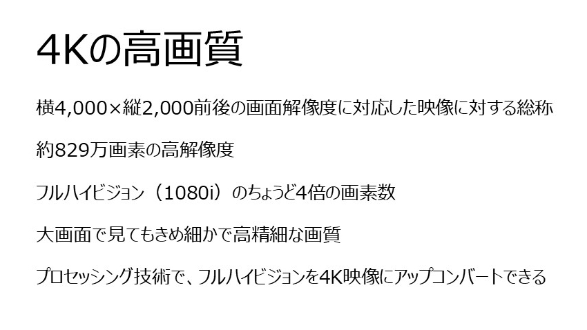
And this one.
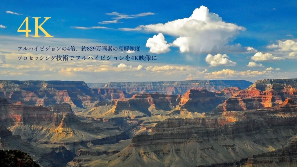
The slide of a mountain image could deliver more “4K high-image quality” impression. Though it used only a little of words.
Design
I had never studied at school nor at work. Something magical, a new perspective.
When you want to convey your message in two dimensions. What you can use are text, photos and design!
This book is full-scale, but easy-to-understand even for a non-designers who need to create some contents and materials by themselves.
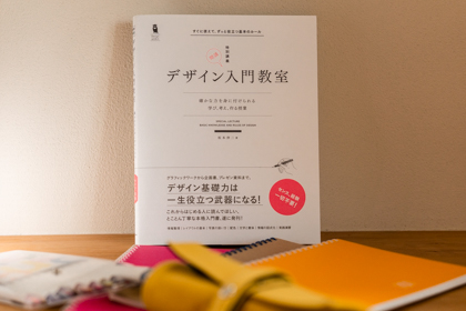
すぐに使えて、ずっと役立つ基本のルール 「デザイン入門教室 [特別講義] | 坂本伸二著」 SBクリエイティブ
On the book cover, there is an advertisement phrase that goes,
“From graphic work to business proposal and presentation material. Basic design skills will be your powerful weapon through out your life!”
Exactly right.
When an ordinary person to do design work, “rules” are much more important than “sense”, “inspiration” and “just an idea”.
And, all the rules had reasons.
This book is a true design teacher whom we can learn design rules and their reasons with many examples and explanations.
Referring to this book, I’m introducing dramatic improvement of presentation materials!
Organize and visualize information
This slide describes the schedule of the website update project.
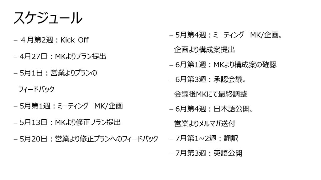
The exact same content will be much easier to understand if it is visualized in a table like below.
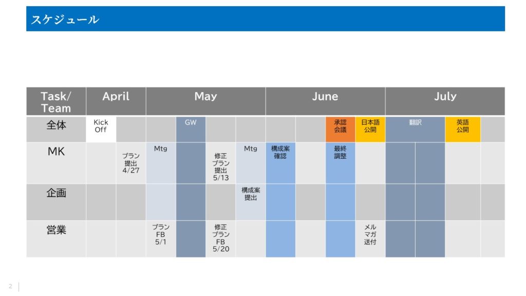
Through the process of making a table, the information was organized.
It is true that not many things can be remembered by your audience though you put all the information on one slide. If so, it is OK to allow them to remember only the key point like “oh, I have to decide around this timing”. Either way, follow-ups will be needed afterwards, anyway.
Schematizing information is very effective in design. By making a diagram, you can directly appeal to the audience’s vision and you can convey information that you want more accurately.
デザイン入門教室[特別講義] P142 「インフォグラフィックとは」
Like stamping an icon
This slide is a goal setting for a project to update a web page.
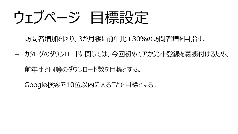
Visualizing with icons look so simple, clear and nice.
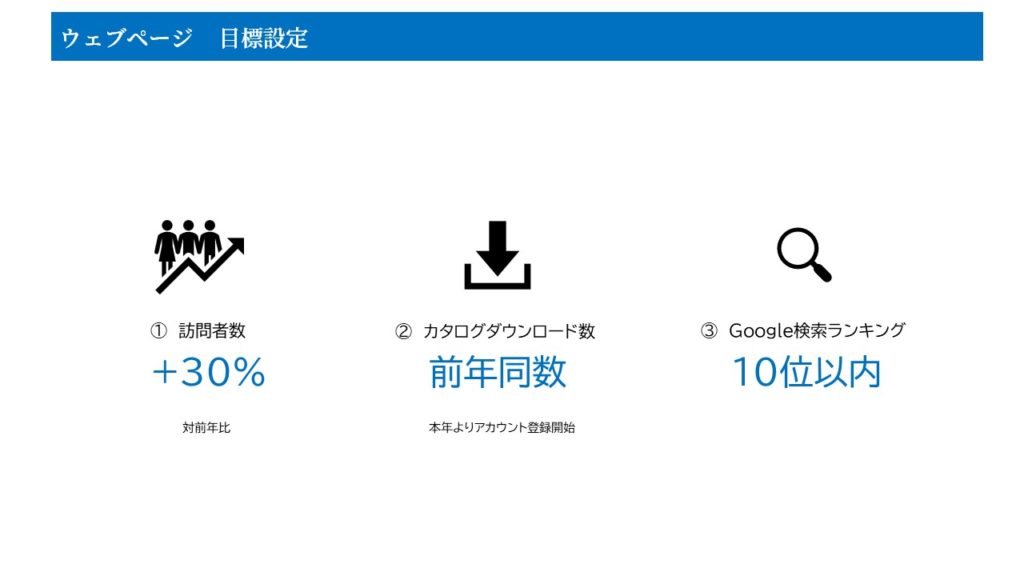
You can select whole bunch of icons from “Icons” under the “Insert” tab of PowerPoint. Icons are really useful!
When you use icons, it is important to clearly separate from surroundings. Subtle differences are not visible to the audience.
デザイン入門教室[特別講義] P123 「アイコン化」
Align anyway!
Aligning elements is the basis of the design basic. If you add auxiliary lines to the slide above, it looks like below. The top, bottom, center and spacing between each element are aligned. To make it look neat, align it.
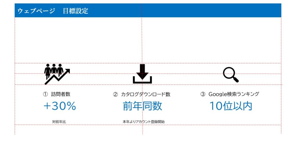
The basis of the layout is “align the elements”. Human eyes and brain feel uncomfortable even a slight deviation. By aligning, “cohesion” is created. It is necessary to align highly related elements.
デザイン入門教室[特別講義] P34 「揃える」
Choose a font that is easily readable!
Design of character, those are fonts. “Mincho style” is thick in height and thin in width. “Gothic style” is even in length and width. There are many variation for both fonts.
If you use suitable fonts for each occasion, you can convey a different impression.
This is Mincho style. We can feel the fragility and delicacy of the summer ending.

This is Gothic style. It looks a casual and joyful atmosphere, doesn’t it?

By learning the expressive power of the font, I changed the font used for e-mails from the default. What I chose was Gothic font. Choosing “my font” makes me feel that I can express my personality even in the text of the e-mail.
Readability is very important for the text. Avoid quirky typefaces and use thin Mincho and thin Gothic fonts.
デザイン入門教室[特別講義] P126 「書体選び」
Speaking of design, I also suffered when I created this website. What color to use where, what typeface to use for the logo, what layout should I choose.
I didn’t know in what basis I should judge, I was at a loss.
I wanted to know the design rule, much earlier!
関連記事はありません